Mass Media 321 is a design class at Washburn University that covers a variety of creative projects throughout the semester. This page presents a comprehensive list of the projects I completed.
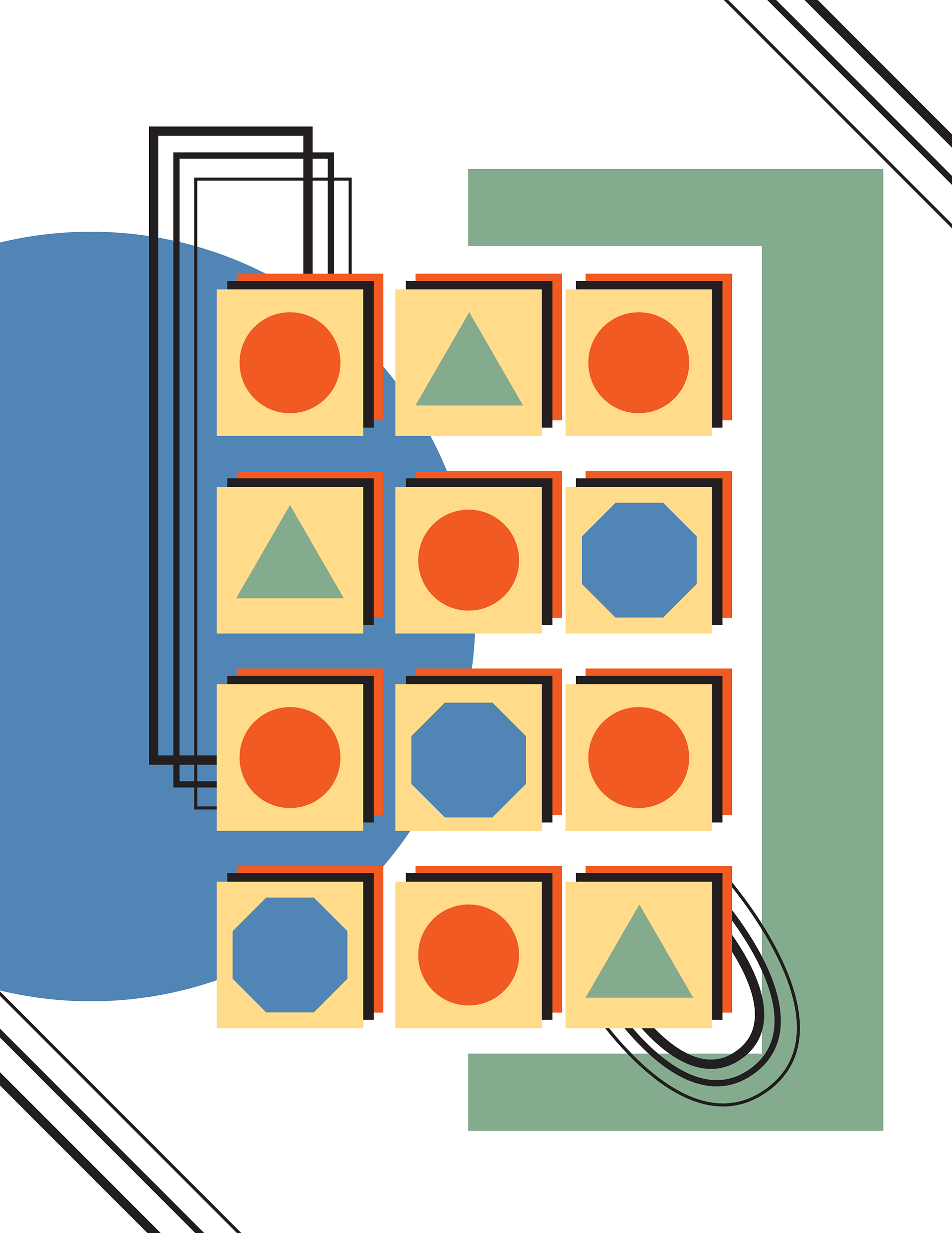
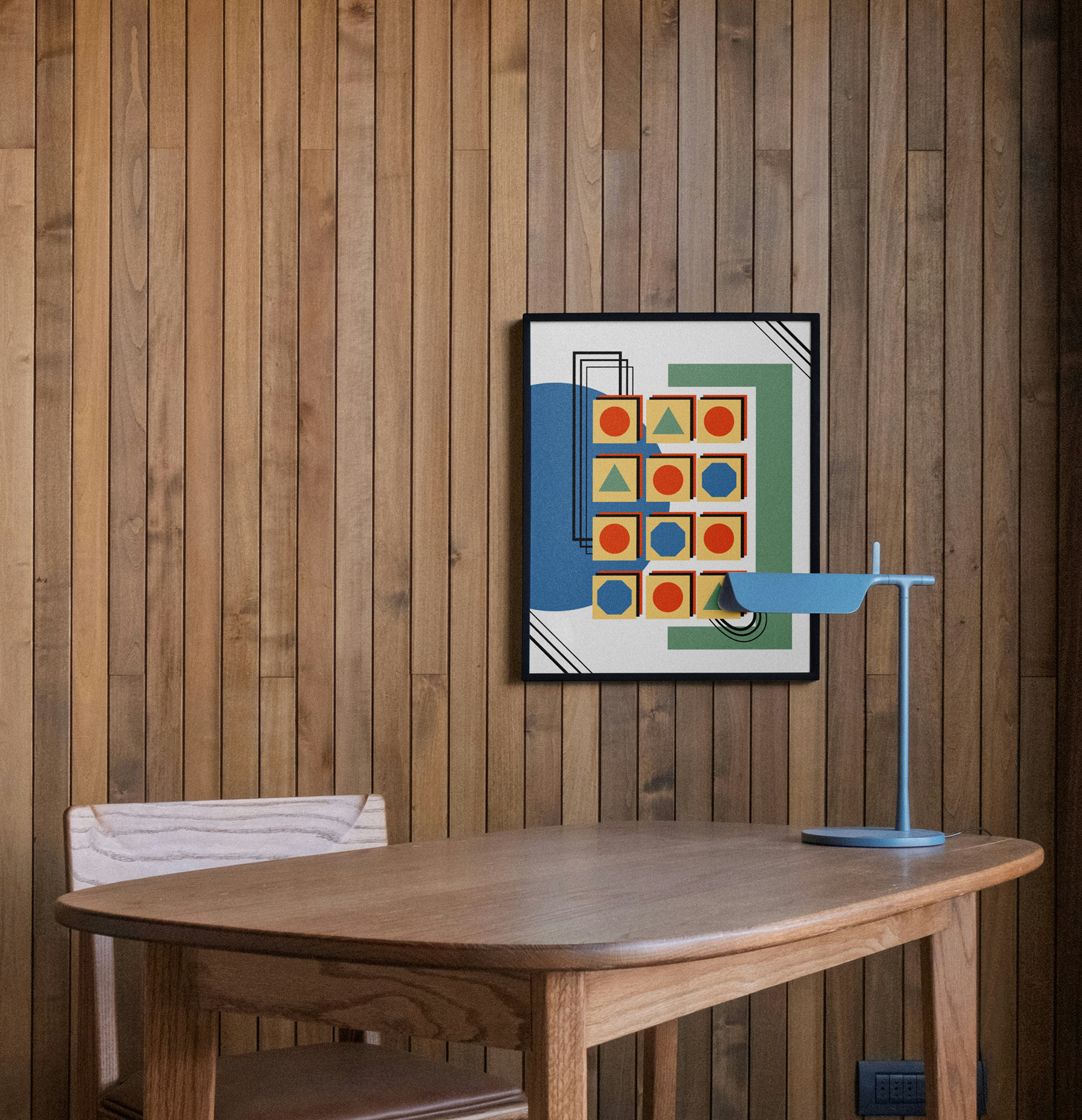
GEOMETRIC DESIGN
This was a simple shape-building exercise in Adobe Illustrator. The goal was to create a design using at least one of each shape shown, as well as lines with three different weighted strokes. I enjoyed how this turned out from using basic shapes.
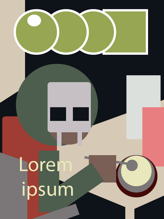
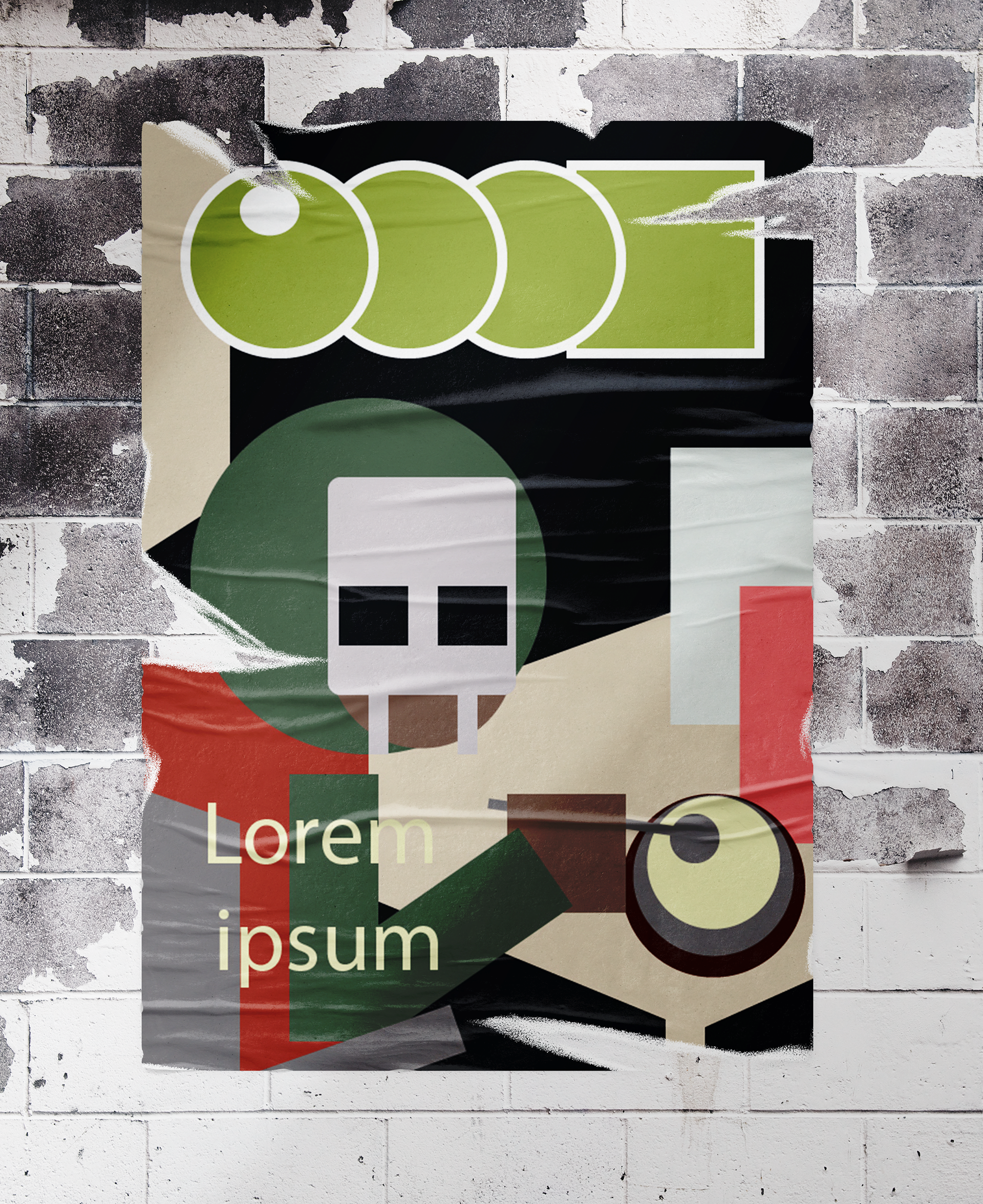
REVERSE ABSTRACTION
This project involved taking a poster design and creating an abstracted version. I chose a poster featuring MF DOOM's Mm..Food album cover. The goal was to study poster and grid layouts and work on creating with simple shapes.
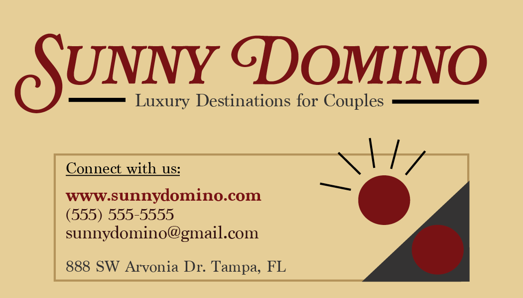
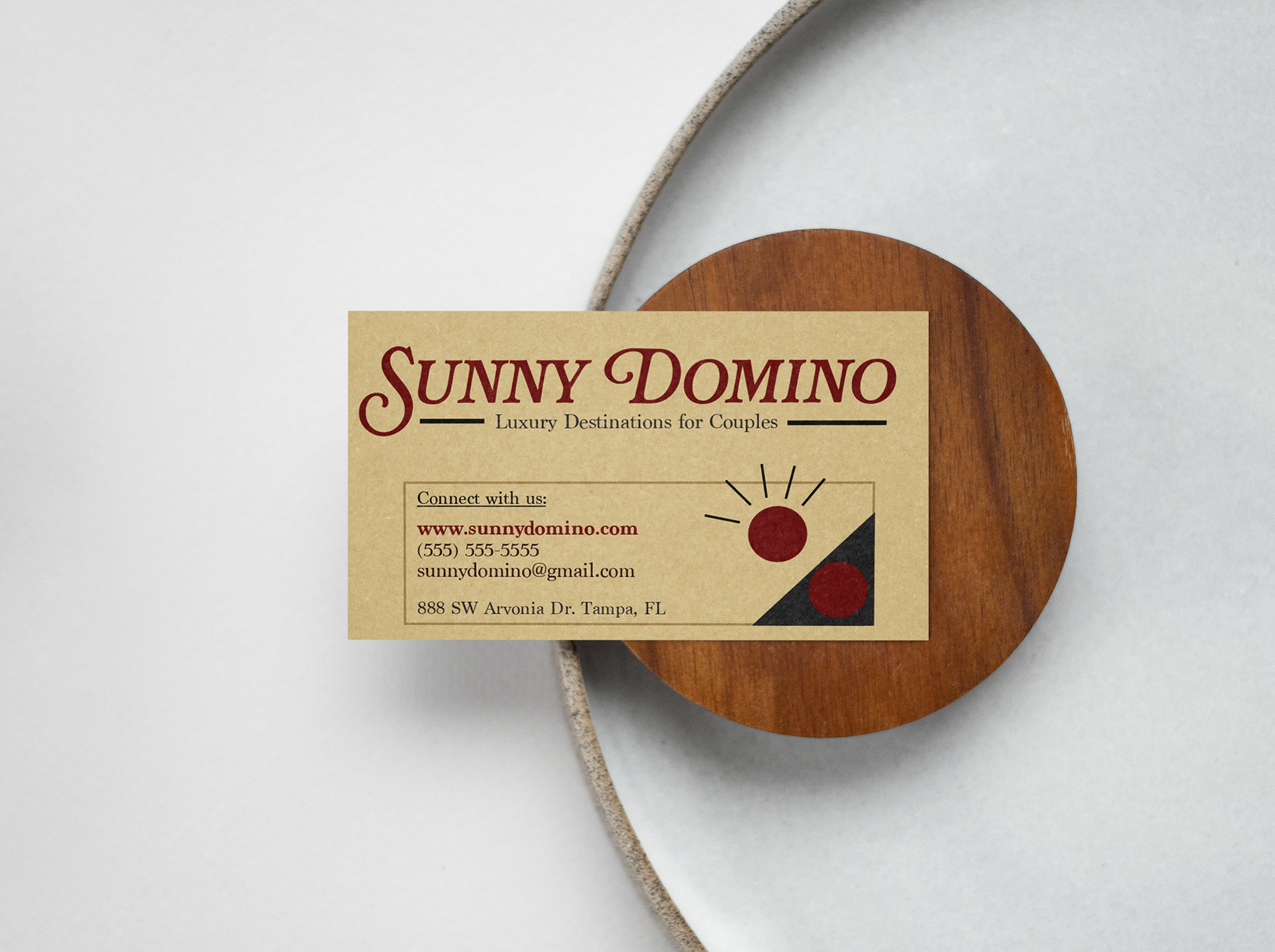
BUSINESS CARD
For this project, we were given a company brief to create a business card for. I received the Sunny Domino, which is a travel agency that helps couples find luxury vacation destinations for couples.
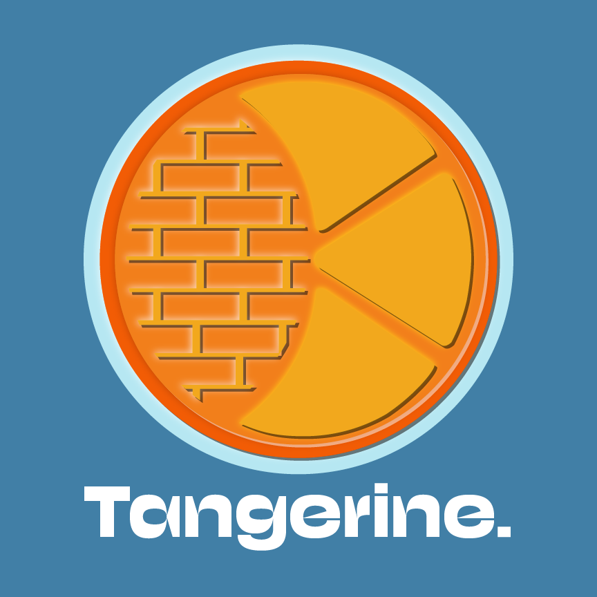
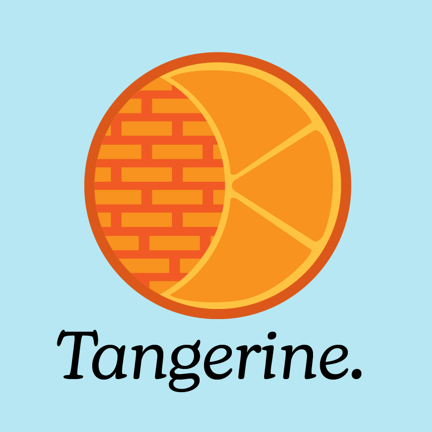
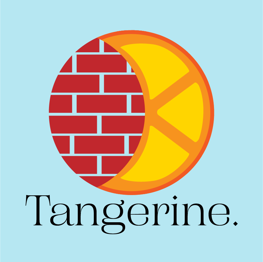
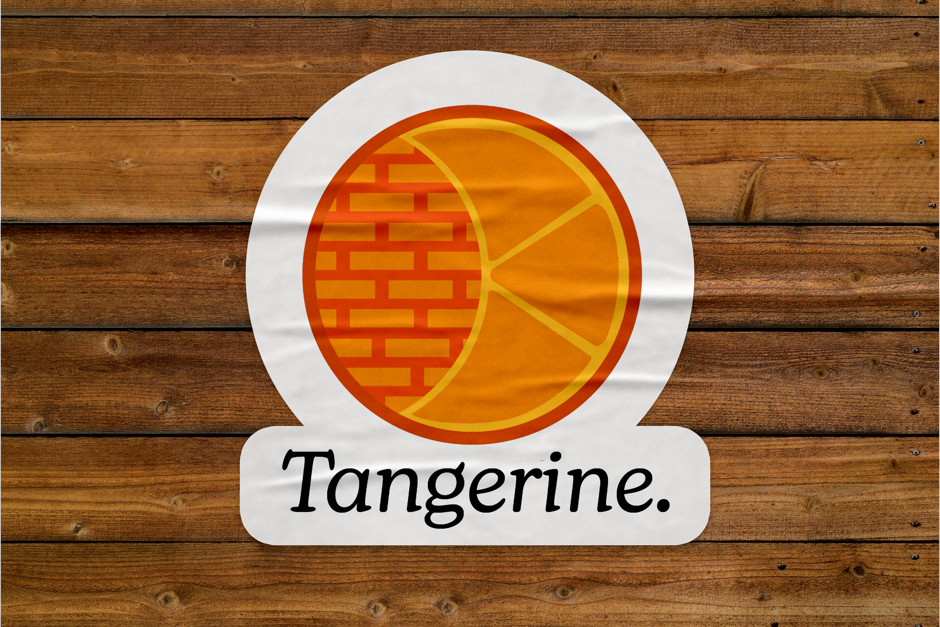
LOGO DESIGN
We were given company briefs and were to create logos from the information given. I received the company Tangerine, which is a leasing office for renovated apartments in a downtown area. We began with sketches and then moved to Adobe Illustrator to create our final logos. The middle logo is my favorite, but I like the typography used with the first.
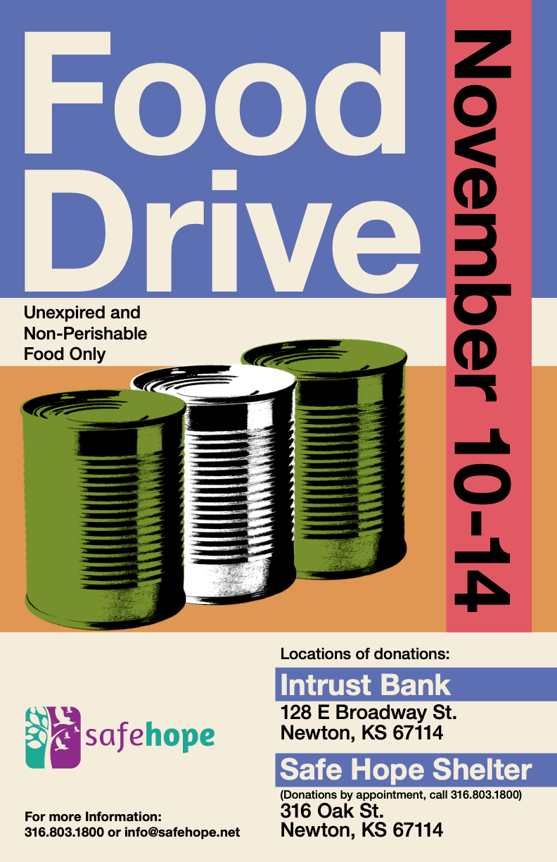
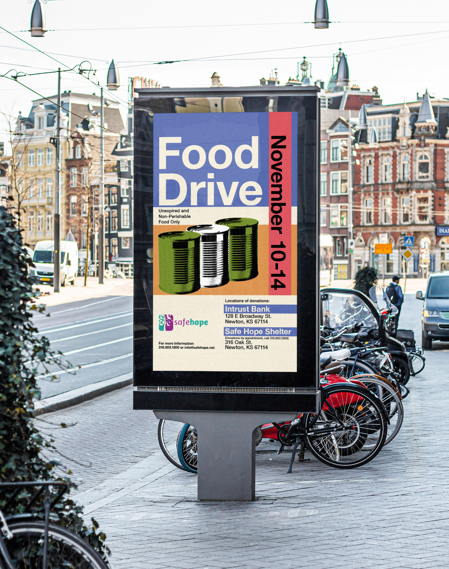
FOOD DRIVE POSTER
Our class was tasked with creating food drive posters for SafeHope, a domestic and sexual violence advocacy service provider in Newton, Kansas. We were allowed to be creative as we liked, within reason, to focus on layouts and hierarchy. My poster takes inspiration from Swiss design principles and is designed to be eye-catching and clean.
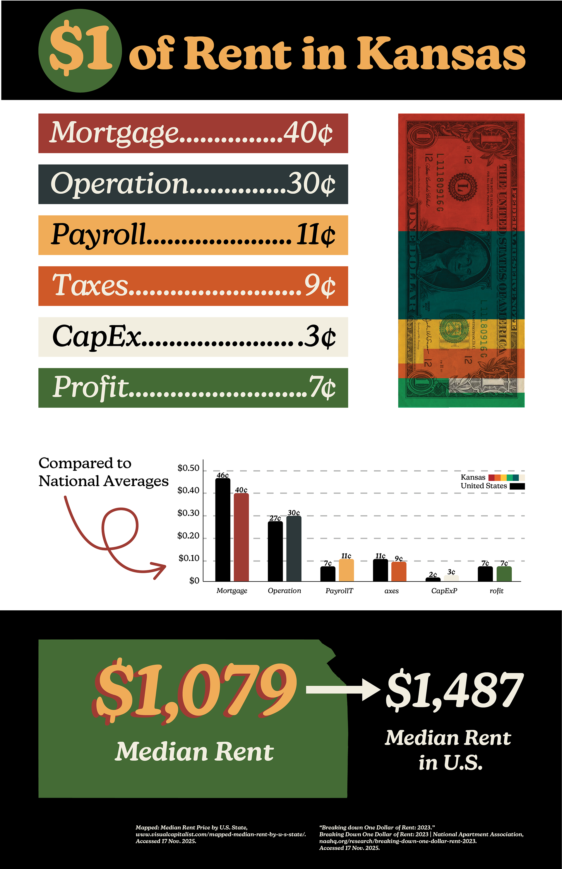
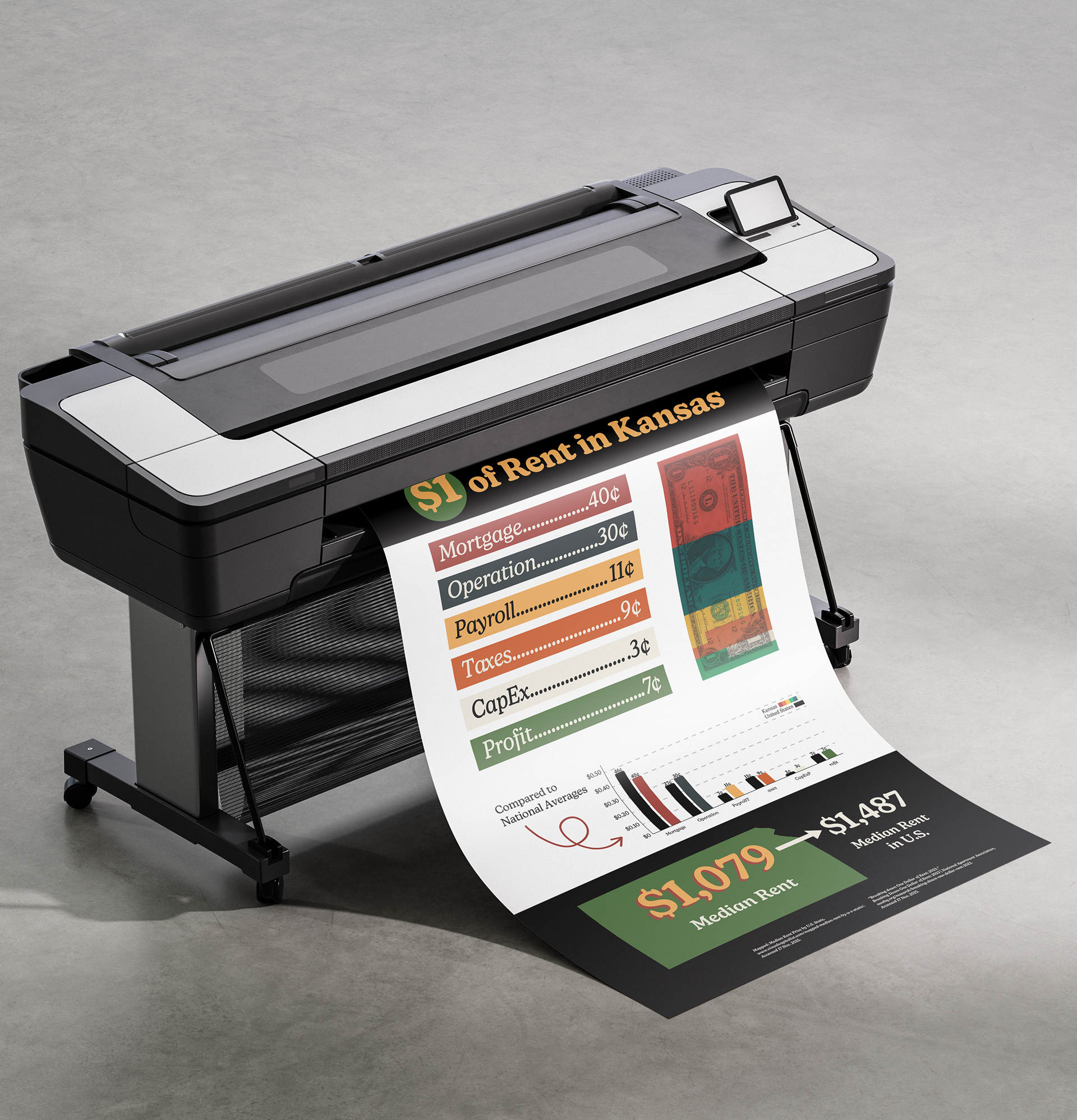
INFOGRAPHIC
This infographic explains how each dollar of rent is spent in Kansas. For this project, I chose to create an infographic on a topic relevant to the state I live in. The goal was to display a sufficient amount of information within a singular poster. I knew I needed a lot of colors for this concept so I aimed to keep them interesting but toned down to not overwhelm the viewer.
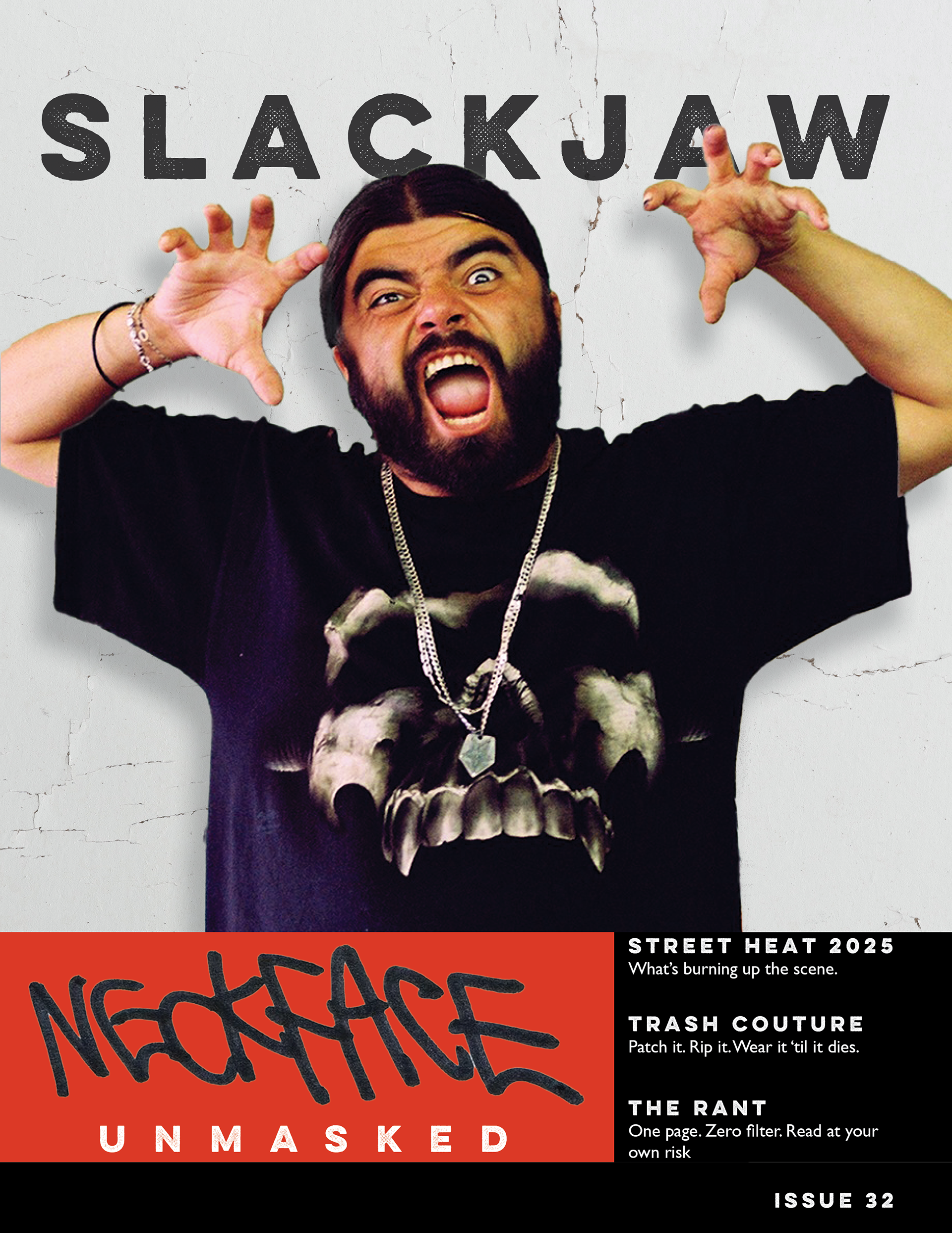
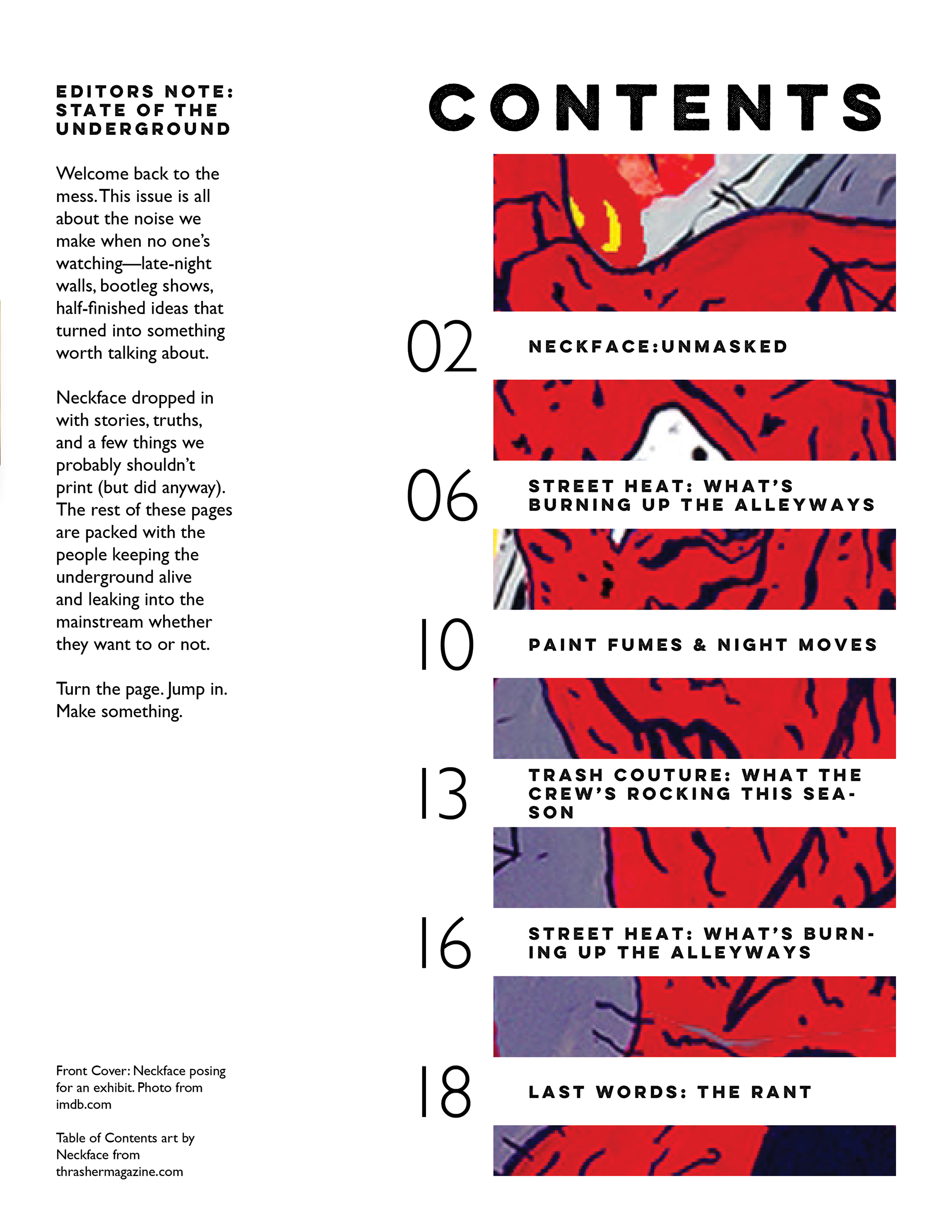
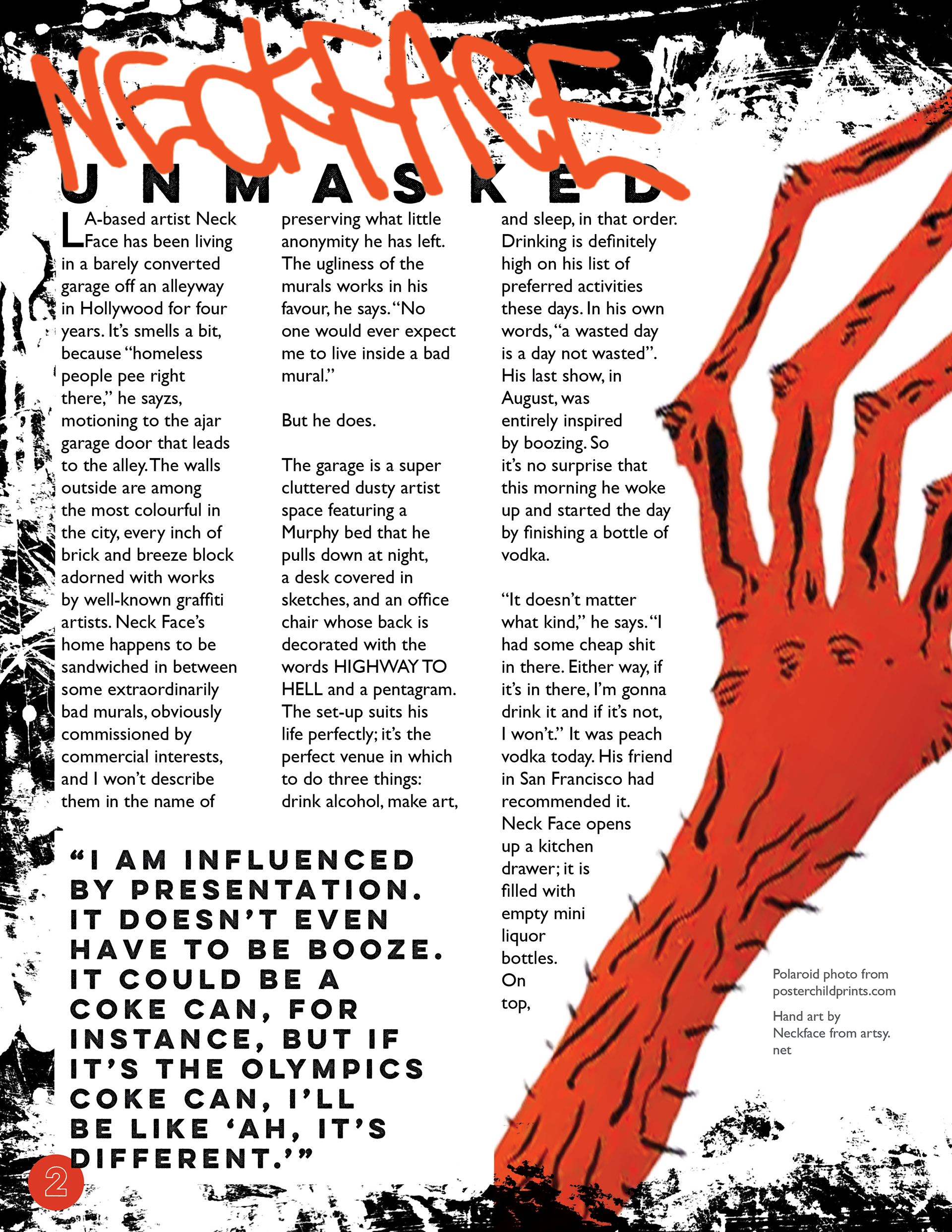
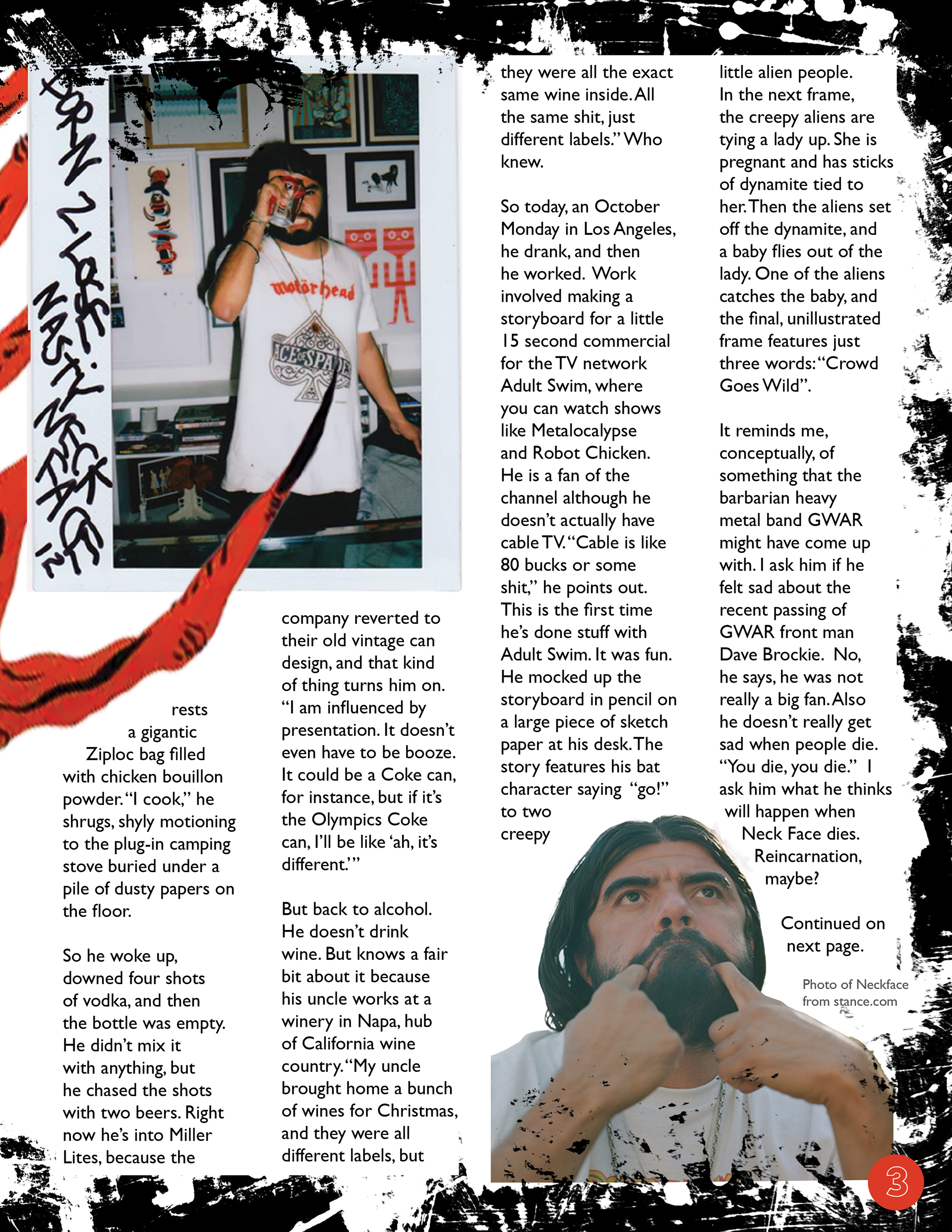
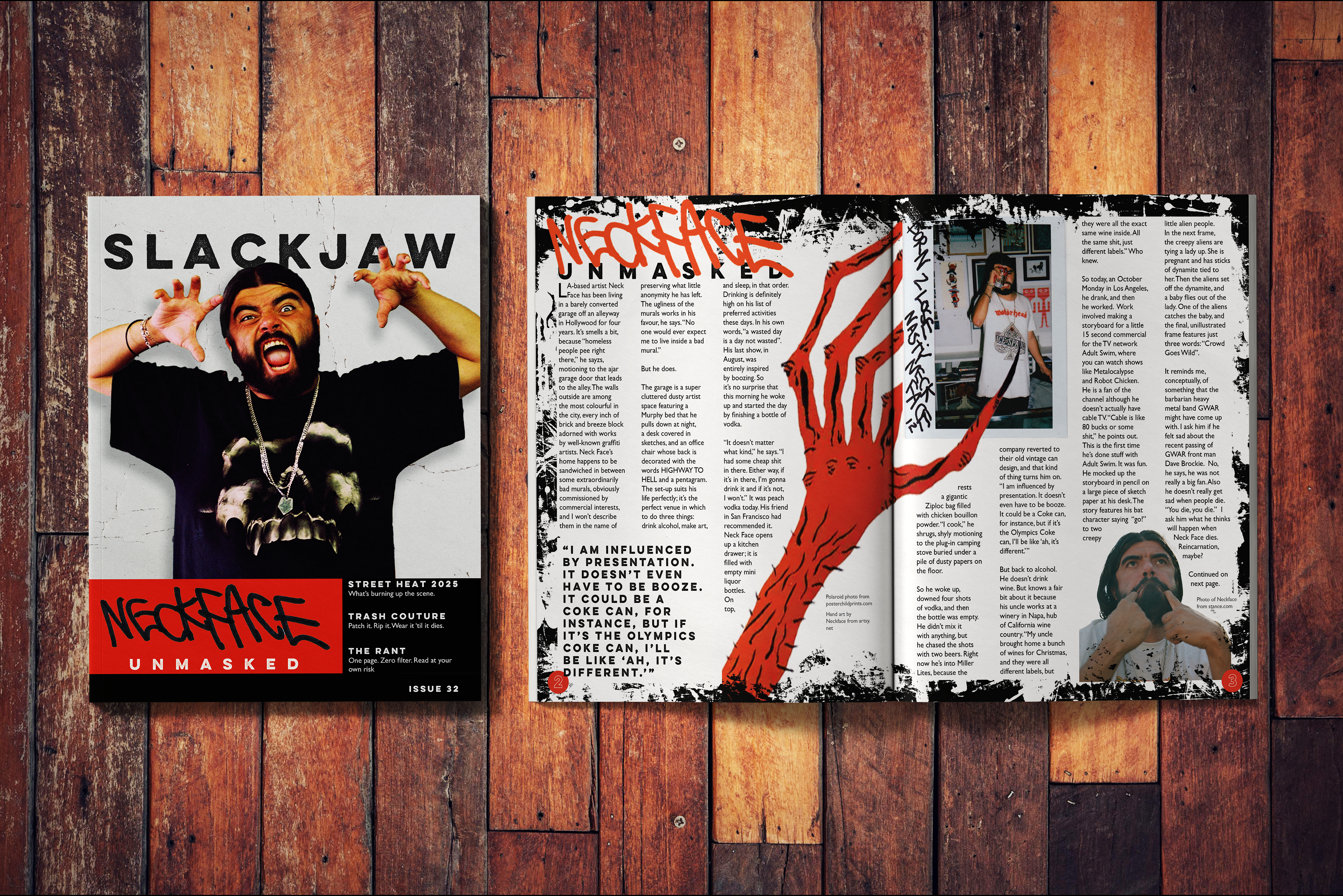
MAGAZINE LAYOUT
This layout is designed for a feature story on NeckFace, an LA-based artist whose work I enjoy. It is meant to emulate the look and feel of the skateboard magazines I grew up reading; gritty yet well-structured. This project includes a cover, table of contents, and a spread with a featured article. The article is from Huck Magazine and written by Caroline Ryder. All images are from the internet and are credited within the layout.