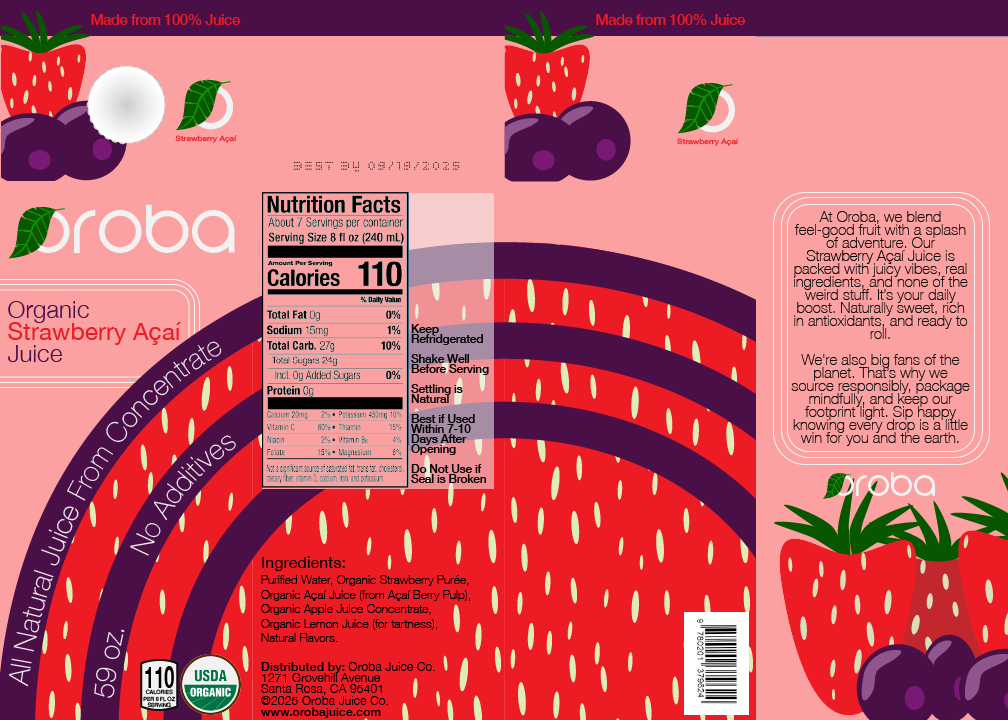
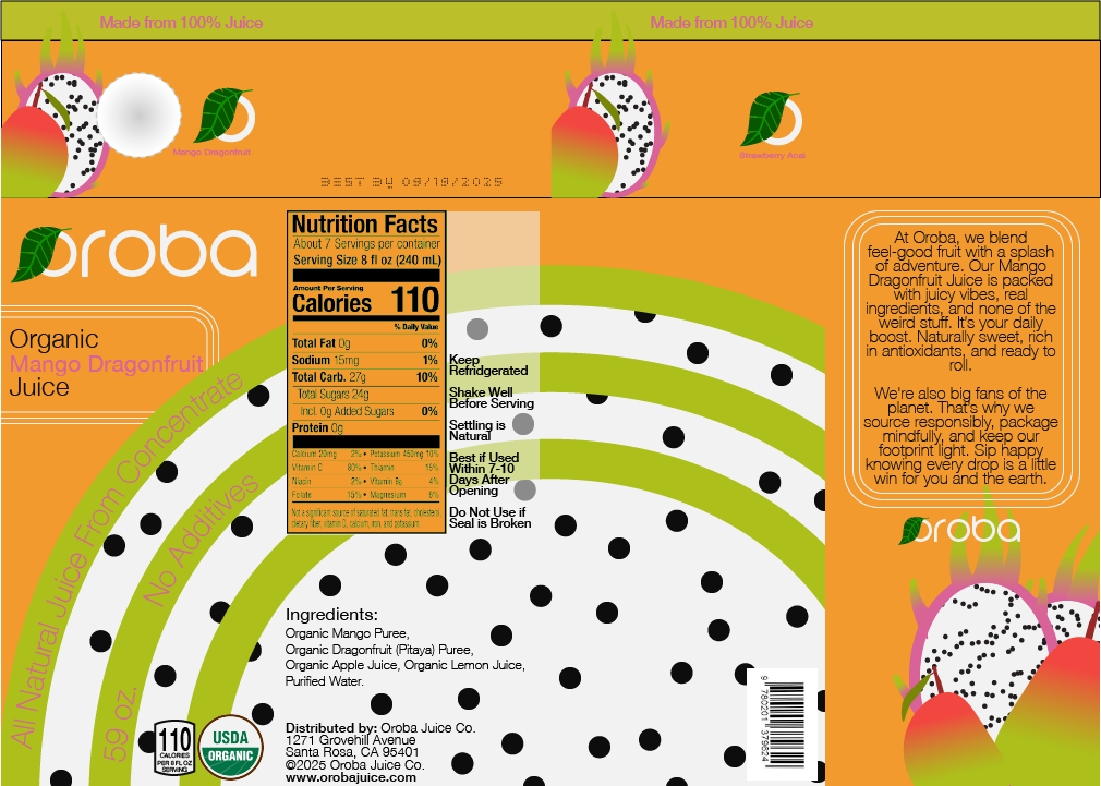
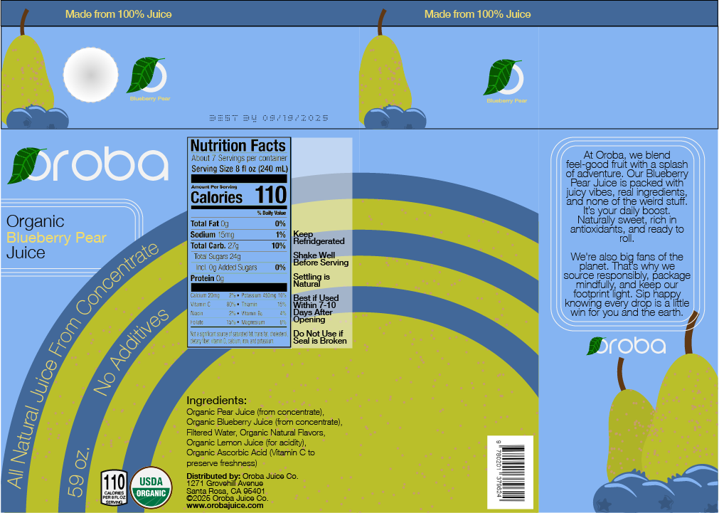
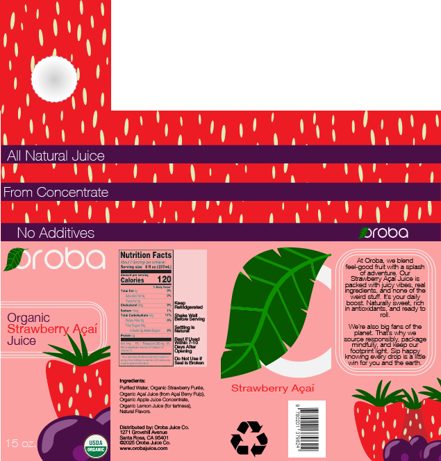
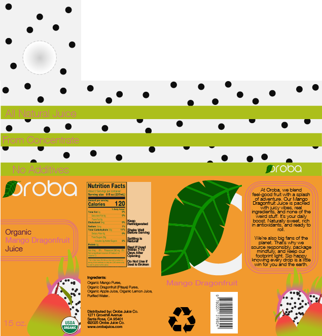
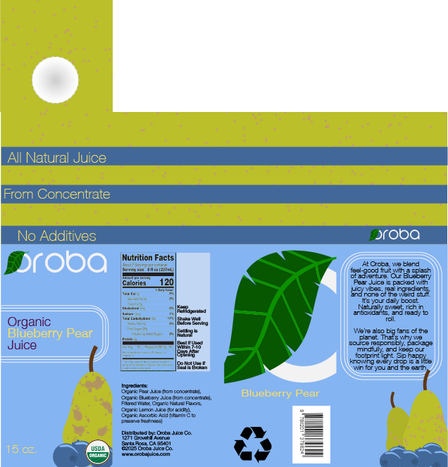
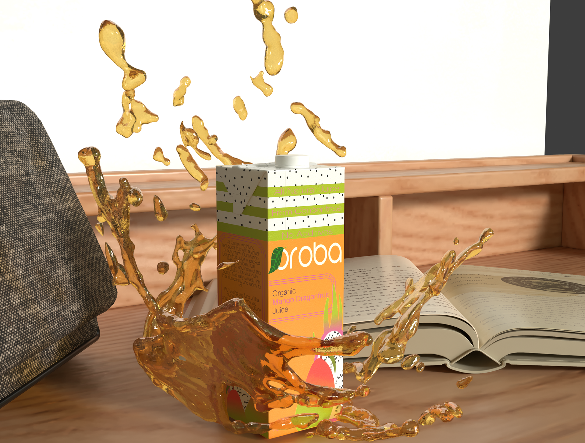
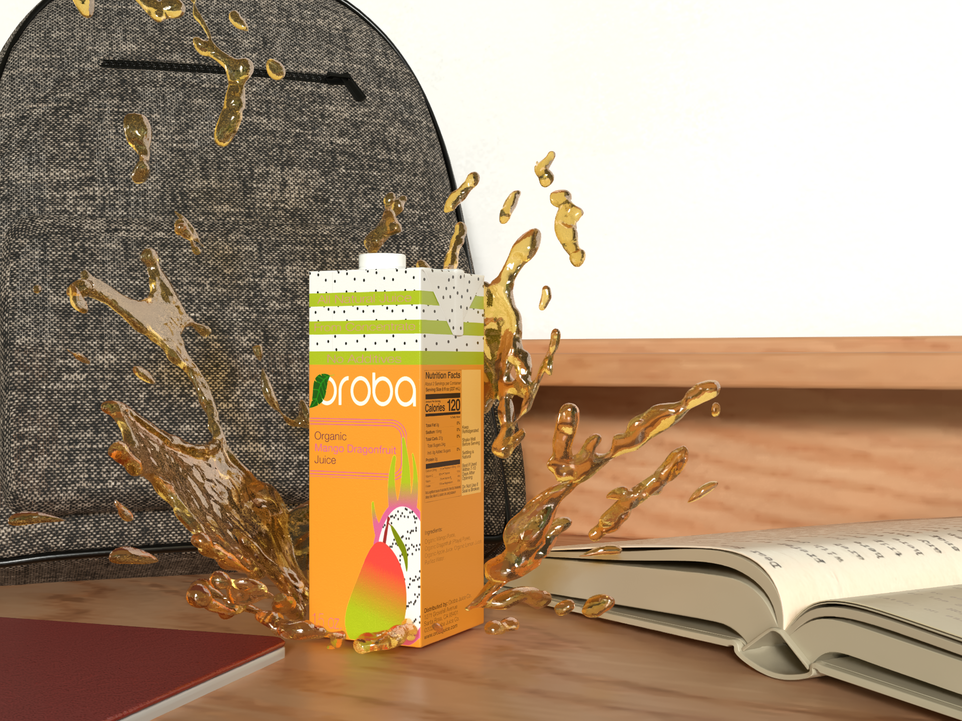
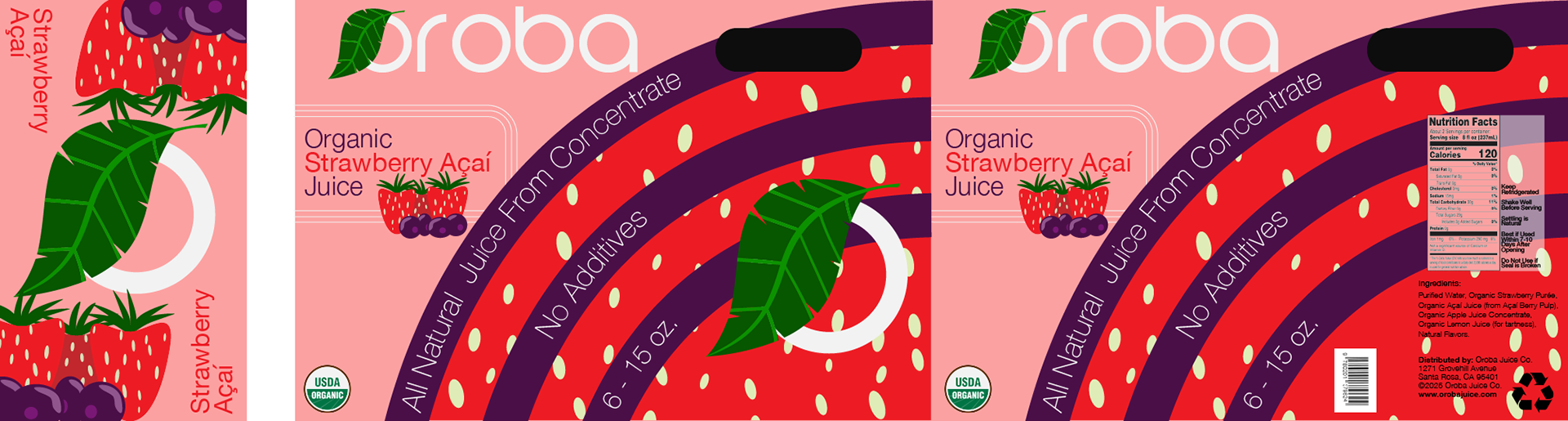
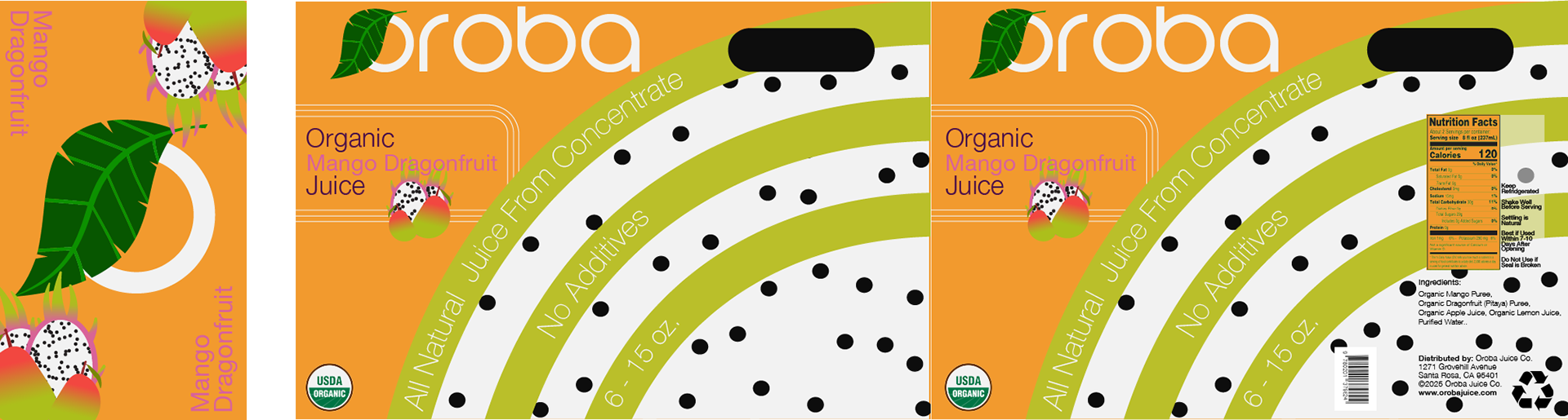
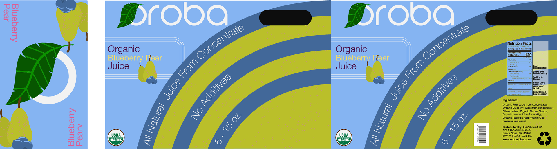
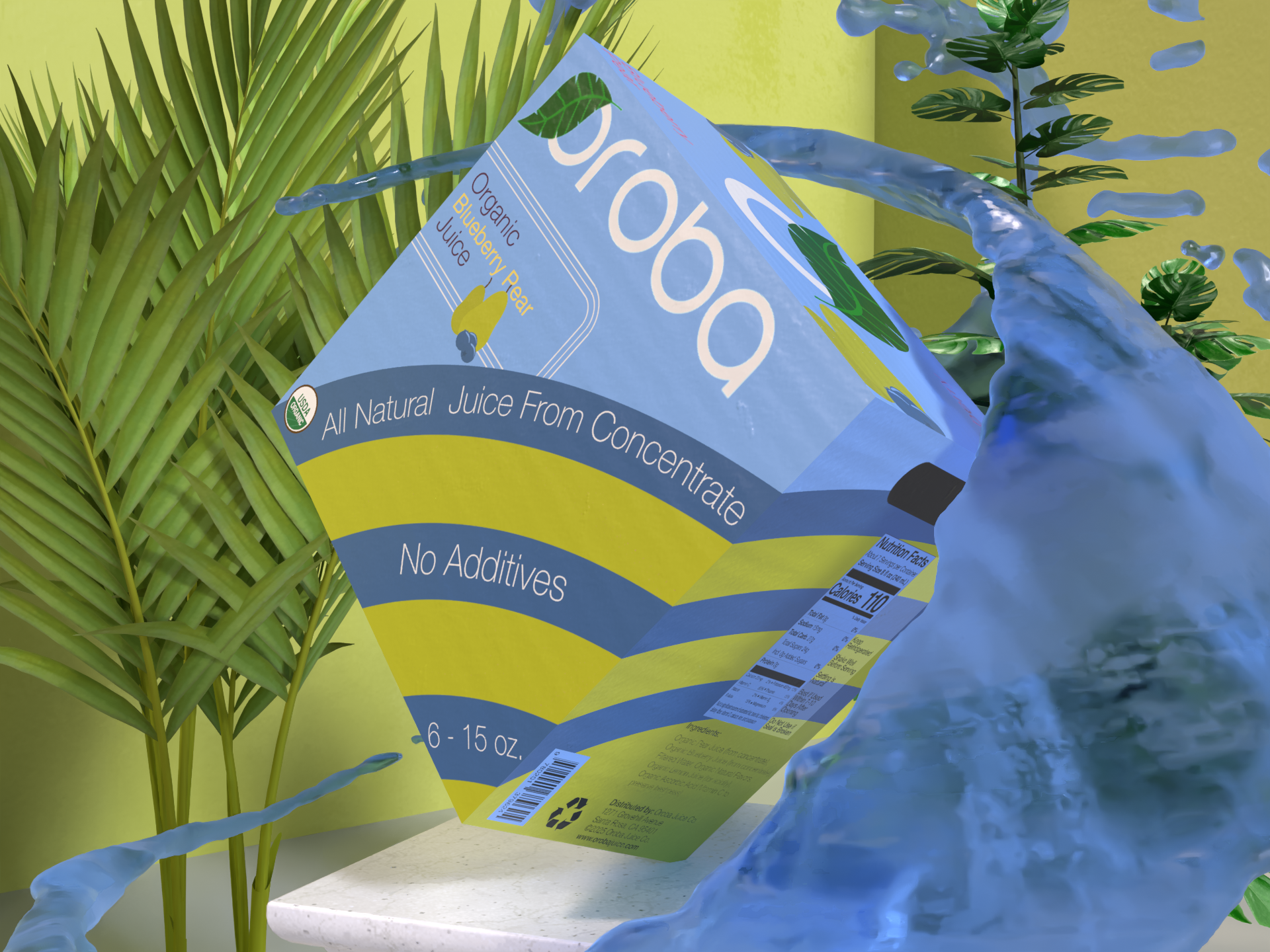
Oroba is a fictional natural juice company with three different, distinct flavors. While having three distinct flavors in its lineup, this product packaging project is designed to have an identity that is echoed through similar design elements to create cohesion, even though the colors and some elements may differ. This project was completed using Adobe Illustrator for the designs and Adobe Dimension for the mockups.

CARTON (59 oz.)
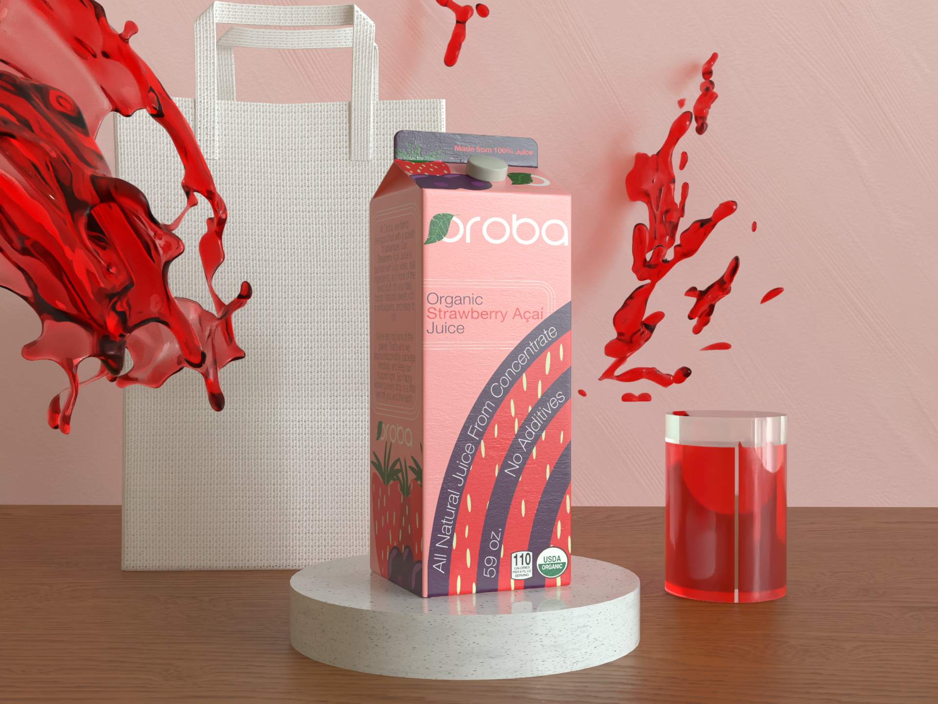
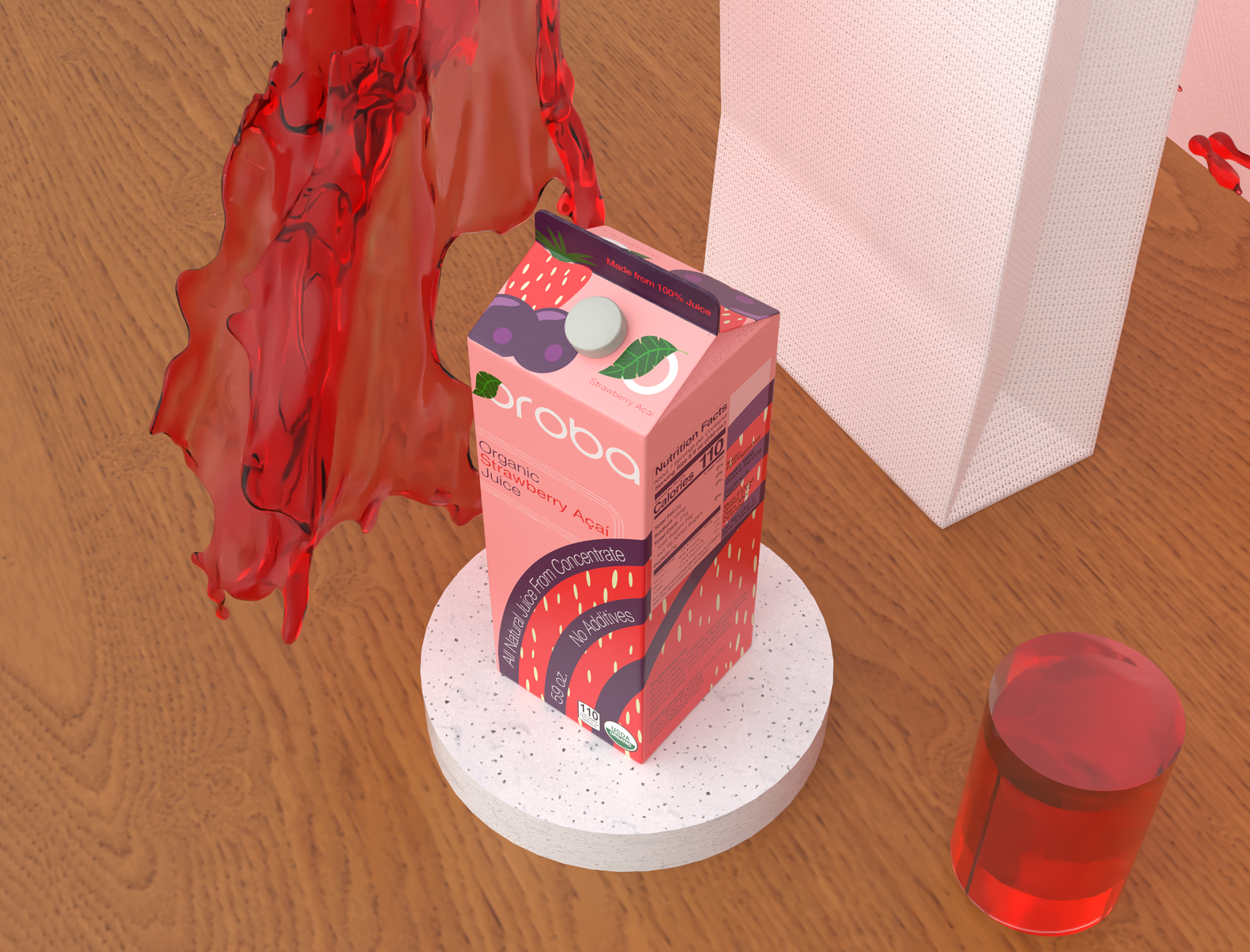
SINGLE CARTON (15 oz.)
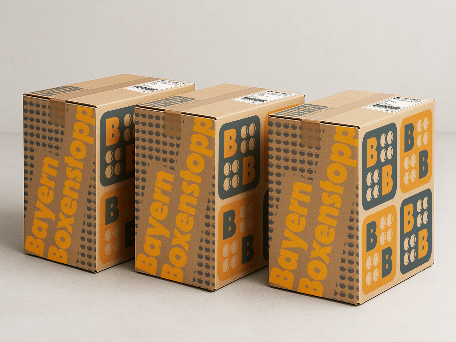
SIX PACK CARTONS (6 - 15 oz.)
COLOR
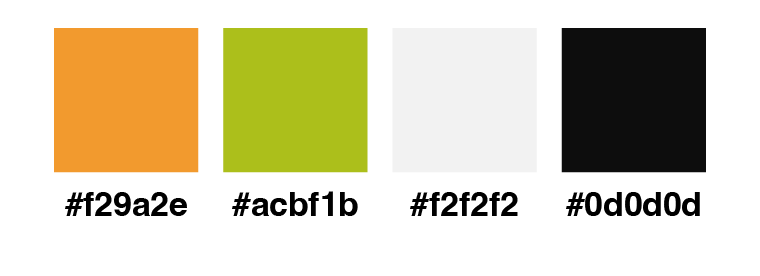
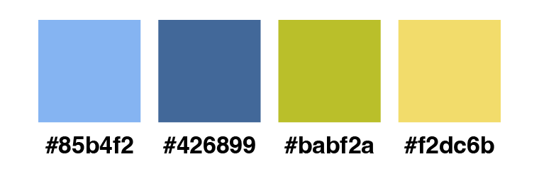
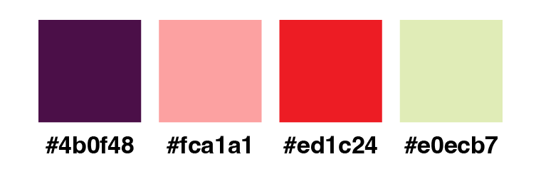
The color choices in this project reflect the flavor of each juice. They are limited to just four per flavor for simplicity.
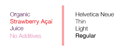
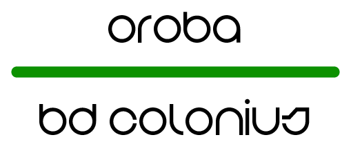
Typography
The fonts chosen for this project are Helvetica Neue and BD Colonius. Helvetica Neue is a classic choice for readability and simplicity, and it is paired with BD Colonius for the brand name and logo to create a modern and geometric feel.